Voor veel mensen is kunst een ver-van-mijn-bed-show. Tijdens mijn tijd als museumcurator realiseerde ik me hoe de kunstwereld vaak een integraal onderdeel is high society, ver weg van het alledaagse leven van de meeste mensen. Dat wilde ik graag veranderen door kunst een prominente plaats geven in het dagelijkse leven van de mensen om me heen. Zo ontstond het ‘Postcards from Australia’-project. In essentie verzend ik ansichtkaarten met aquarellen en gedichten eropvanuit Australië naar Europa tijdens mijn Working Holiday. Door kunst in te zetten als communicatiemiddel maak ik het onderdeel van de alledaagsheid.
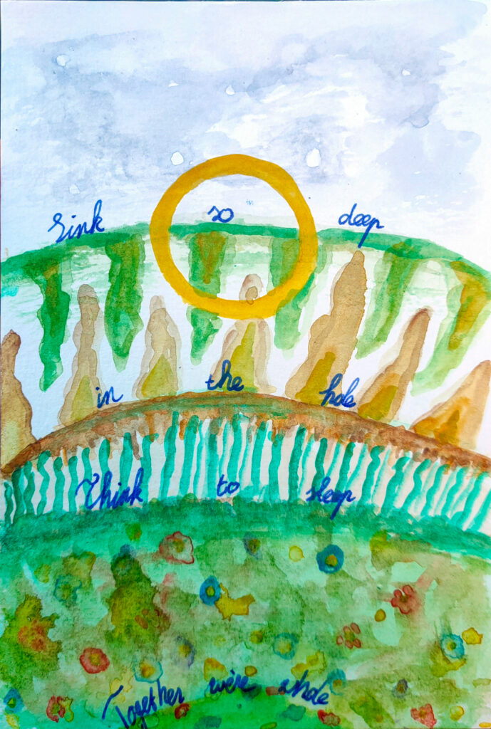
Urban Dreams, Sydney 2023
Ik koos voor de banaliteit van ansichtkaarten, omdat ze intiem en persoonlijk zijn. Communicatie is inherent aan ansichtkaarten, waardoor ze automatisch dragers van emoties en betekenis zijn die mensen over tijd en afstand met elkaar verbinden.
De inspiratie en thema’s voor mijn kunstwerken variëren van natuurgebieden tot uitdagingen onderweg en mensen die ik heb leren kennen. Mijn achtergrond als historicus dient vaak als gids in de keuze voor onderwerpen. De meeste werken gaan over connectie: met het land, het verleden, de verschillende gemeenschappen, collega’s, de achtergeblevene, familie, of zelfs het metafysische.
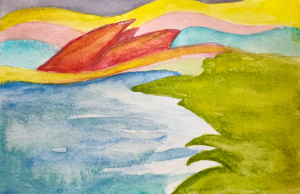
Opera House, Sydney 2023
Het is jaren geleden dat ik met aquarel werkte, maar deze kunstvorm is momenteel het meest praktisch door zijn compactheid. Ik begin iedere kaart met lichtblauwe lijnen, die ik vervolgens aanvul met kleuren en details. Sommige kaarten werk ik af met een zwarte pen voor de fijnere details. Wanneer de afbeelding klaar is, begin ik woorden en zinnen te brainstormen voor het bijbehorende gedicht. Vervolgens schrijf ik die samen met een persoonlijke boodschap op de kaart en verstuur ik deze.
Het verzenden van ansichtkaarten vanuit de Australische Outback naar Europa kan soms langer dan een maand duren. Het is alsof ik de kunst door de tijd verstuur, met de brievenbus als tijdmachine. Soms geef ik de kaarten persoonlijk af. De reacties die ik kreeg waren keer op keer hartverwarmend. Ik heb enorme lieve berichten, telefoontjes en zelfs een kunstwerk mogen ontvangen als reactie op mijn kaarten.
Uiteindelijk hoop ik de kaarten en gedichten te bundelen in een boek. Dit zou ik willen presenteren tijdens een expositie, samen met foto’s en andere kunst die ik tijdens de reis gemaakt heb.
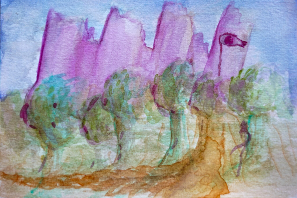
Sinkhole, Mount Gambier 2024
Het project ‘Ansichtkaarten uit Australië’ is een manier om mijn reis door Australië op een betekenisvolle manier te delen met mijn dierbaren. Via deze kaarten hoop ik mensen met elkaar te verbinden: met Australië, met mij, met kunst en met elkaar. Jouw steun kan deze tentoonstelling en dit boek werkelijkheid maken. Als je wilt helpen, kun je me via deze link een kop koffie kopen. Bedankt voor het lezen, en ik hou je graag op de hoogte van mijn artistieke avontuur.
For many people, art is a distant and unattainable concept. While working as a museum curator, I realised how the art world often remains an integral part of high society, far removed from most people’s everyday lives. I wanted to change that by giving art a prominent place in the daily lives of those around me. Thus, the ‘Postcards from Australia’ project was born. During my Working Holiday, I send postcards featuring watercolours and poems from Australia to Europe. By using art as a means of communication, I integrate it into the everyday.
Urban Dreams, Sydney 2023
I chose the banality of postcards because they are intimate and personal. Communication is inherent to postcards, making them automatic carriers of emotions and meaning, connecting people across time and distance.
The inspiration and themes for my artworks range from natural landscapes to challenges on the road and people I have met. My background as a historian often guides my choice of subjects. Most works revolve around connection: with the land, the past, different communities, colleagues, those left behind, family, or even connection to the metaphysical.
Opera House, Sydney 2023
It has been years since I worked with watercolours, but this medium is currently the most practical due to its compactness. I start each card with light blue lines, which I fill in with colours and details. Some cards are finished with a black pen for finer details. Once the image is complete, I begin brainstorming words and phrases for the accompanying poem. I then write these, along with a personal message, on the card and send it off.
Sending postcards from the Australian Outback to Europe can sometimes take over a month. It feels like I am sending art through time, with the letterbox acting as a time machine. Sometimes, I hand-deliver the cards. The responses I received have been consistently heartwarming. I have received incredibly kind texts, phone calls, and even an artwork in response to my cards.
Ultimately, I hope to compile the cards and poems into a beautiful book, which I dream of presenting at an exhibition alongside photos and other art created during my journey.
Sinkhole, Mount Gambier 2024
The ‘Postcards from Australia’ project is a way to share my journey through Australia with my loved ones in a meaningful way. Through these cards, I hope to connect people: with Australia, with me, with art, and with each other. Your support can make this exhibition and book a reality. If you would like to help, you can buy me a coffee via this link. Thank you for reading, and I will keep you updated on my artistic adventure.
Le samedi 9 et le dimanche 10 septembre 2023, j’ai organisé une exposition à la SooS intitulée ‘Village Global’. Dans cette exposition, j’ai présenté douze œuvres sur toile autour du thème de la vie villageoise à l’ère de la mondialisation. Dans cette exposition, j’ai systématiquement placé deux tableaux en face l’un de l’autre. L’un offrait une perspective de l’intérieur et l’autre une perspective de l’extérieur. Vous pouvez consulter l’article de presse sur mon exposition sur WeertDeGekste. Après cette exposition physique, j’ai décidé de rendre la série accessible également sous forme numérique pour les personnes qui n’ont pas pu être présentes et pour d’autres intéressés. Ci-dessous, vous trouverez les six thèmes, chacun accompagné de deux œuvres et des textes qui étaient également présents physiquement dans la salle d’exposition. Je vous souhaite beaucoup de plaisir à les regarder.
Frontières
Les frontières sont imaginaires : elles sont l’expression de notre imagination collective. Une frontière existe sur papier, à travers des symboles et dans notre langue. Elles ont une grande influence sur notre expérience du monde. Ces deux œuvres sont basées sur la vue d’en haut de l’Europe d’une part et de Tungelroy d’autre part. Les deux tableaux explorent la relation entre les frontières abstraites, la mémoire et l’attribution de sens.
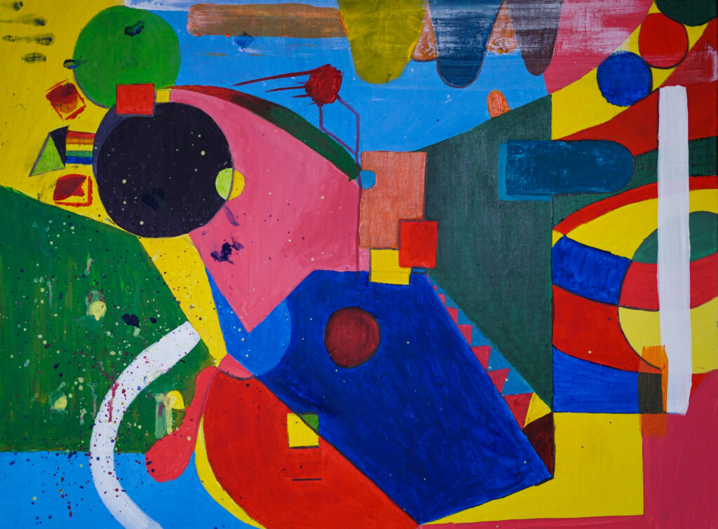
Le Concept Abstrait de l’Europe
“Le concept abstrait de l’Europe” a été créé directement après mon Erasmus à Glasgow. Le style est inspiré de Kandinsky. L’œuvre a été créée avec le souvenir de la période Erasmus. Non seulement ma vie personnelle, comme les relations amoureuses et les amitiés qui y ont été créées et vécues, mais aussi le contexte dans lequel s’est déroulée la période Erasmus m’ont inspiré à créer une visualisation abstraite de mes quatre mois à l’étranger. C’était la période où le Royaume-Uni devait officiellement quitter l’Union européenne. L’œuvre est abstraite, car l’idée entière de l’Europe, de l’Union européenne et d’une identité européenne est abstraite.
Créé en : 2020
Matériaux : Acrylique
Dimensions : 60 x 80 cm
Souvenirs
“Souvenirs” s’inspire de mon village natal, Tungelroy. De manière surréaliste, je crée dans cette œuvre un lien entre les souvenirs de ma jeunesse et leur emplacement géographique. Les soirées en ville, les répétitions de fanfare, les promenades, les balades à vélo : tout trouve sa place. Le village est en effet stratifié dans le temps, où l’histoire et le présent se croisent. Cela confère à la peinture sa profondeur.
Créé en : 2022
Matériaux : Acrylique, Huile
Dimensions : 60 x 80 cm
Monuments
Un village est reconnaissable à son moulin, à son clocher, à son école, à ses terrains de jeux et à ses parcs. Les bâtiments sont au cœur d’un lieu de résidence et révèlent la structure d’un village. À Tungelroy, le clocher domine toujours le paysage urbain. L’église suit les saisons et les fêtes chrétiennes. La naissance, l’amour et la mort se succèdent. Cela a quelque chose de naturel, cette vie cyclique, mais attention. Les murs ont des yeux et les gens posent des questions. Il n’est pas mentalement facile d’être “différent” quand tout doit suivre son cours supposé naturel.
Tranquillité
“Tranquillité” représente le calme et la sérénité que le village offre. Le sentiment de sécurité. Vous savez à quoi vous attendre. Vous êtes en pleine nature et suivez le chemin historique que la communauté a tracé pour vous. Les traditions sont belles et doivent être préservées. Le village offre une évasion à l’agitation de la ville. La vie de village est un rêve.
Créé en : 2022
Matériaux : Acrylique, Huile
Dimensions : 40 x 30 cm
Skyline T-Roy
“Skyline T-Roy” remet en question la pensée cyclique naturelle. L’œuvre suit le cycle météorologique de gauche à droite, du bon au mauvais. Au cours de ce voyage, le spectateur rencontre la pression financière, la pression du temps, la pression des traditions et la pression de la communauté du village.
Créé en : 2023
Matériaux : Acrylique, Huile
Dimensions : 120 x 30 cm
The circle of life
Is a closed ring
The ring is ticking
Like an index finger
The finger of the neighbour
Points at the concrete wall
The walls have ears
And the houses have eyes
The working-class hero
The passing of the year
The couch in front of the TV
Are you really here?
Personnes
Réaliser le portrait d’une personne est difficile. Si vous faites un portrait hyperréaliste, vous manquez les nuances et la beauté intérieure. Si vous faites un portrait abstrait, personne ne voit le langage corporel et l’apparence. Pourtant, dans cette série, j’ai choisi l’option abstraite. Ces deux portraits symbolisent deux personnes de mon village. D’un côté, une vraie “Limburgse Maedje”, enracinée dans les coutumes et traditions existantes du village. De l’autre, un véritable citoyen du monde, ouvert à l’auto-interrogation et à la réinvention constante de soi.
MK
‘MK’ symbolise une véritable “Limburgse Maedje (madame limbourgious)”. Tout comme la Tungelroyse Beek, elle est indissociable de l’endroit. Le village fait partie intégrante d’elle-même et elle fait partie intégrante du village. Sans l’un, l’autre perdrait sa signification.
Créé en : 2023
Matériaux : Acrylique, Huile
Dimensions : 120 x 90 cm
KH
‘KH’ concerne une personnalité artistique ouverte. L’aventure, la découverte et l’ouverture sont des mots clés de sa vie. Elle s’envole de temps en temps avec ses nouvelles connaissances et idées pour enrichir le village.
Créé en : 2022
Matériaux : Acrylique, Huile
Dimensions : 120 x 90 cm
Langue
La langue en dit long sur qui vous êtes et sur la façon dont vous souhaitez vous présenter. Ainsi, la langue est un élément important de l’identité. Les Limbourgeois voient la langue et les expressions limbourgeoises comme quelque chose d’unique, et c’est en quelque sorte le cas. Chaque lieu de résidence a ses propres variations dialectales. Dich, diech, du : vous entendez tout cela ici. L’utilisation de la langue et les significations sociales de la langue existent dans le monde entier. Tout le monde utilise la langue pour se distinguer des autres et se joindre à un groupe particulier. Ces langues forment ensemble les langues du monde. Ensemble, nous sommes le monde.
Limbourgeois
‘Limbourgeois’ est une œuvre multimédia complexe. Dans un alphabet fait maison, inspiré de notes de musique mélodiques, on peut lire une décennie de citations de mes bons amis limbourgeois. Les cartes de recherche linguistique sur le limbourgeois dominent l’œuvre. Il y a deux siècles, le limbourgeois n’était pas encore considéré comme une langue. Les scientifiques et les historiens se sont activement engagés à l’époque pour donner à la province sa langue et son identité. C’est ainsi qu’est née notre identité limbourgeoise complexe. Et le poisson ? C’est la langue limbourgeoise, nageant entre le néerlandais, l’allemand et le français.
Créé en : 2023
Matériaux : Impression, Huile
Dimensions : 50 x 50 cm
Langues
‘Langues’ est une œuvre multimédia réalisée avec l’aide de l’IA, de Photoshop, de la peinture à l’huile et surtout des citations d’amis et de connaissances du monde entier. Pour cette œuvre, j’ai demandé à plus de cinquante personnes d’envoyer leurs expressions et citations préférées. Afrikaans, arabe, russe, norvégien, hindi : tout y est. Ainsi, nous formons ensemble l’eau dans laquelle toutes les langues peuvent nager. Nous formons ensemble les langues du monde.
Créé en : 2023
Matériaux : Impression, Feutre, Huile
Dimensions : 50 x 50 cm
Carnaval
Les Limbourgeois l’attendent toute l’année : le carnaval. Heureusement, nous n’avons plus à attendre aussi longtemps avant de pouvoir célébrer le carnaval. Entre-temps, l’année est pleine de afterparty’s et de carnavals d’été. La tradition du carnaval a des racines historiques, même si la célébration moderne est relativement récente. Ce n’est qu’après la Seconde Guerre mondiale que le carnaval s’est développé tel que nous le connaissons aujourd’hui. Pourtant, nous nous accrochons fermement aux traditions et aux coutumes que nos grands-parents ont créées. Pourquoi ?
Prince Carnaval
‘Prince Carnaval’ est une œuvre abstraite qui montre les multiples facettes du carnaval. Tout y est chaotique et fou, convivial et musical. Tout le monde participe et chacun peut être qui il veut. Le monde tourne à l’envers pendant le carnaval. C’est tellement agréable !
Créé en : 2023
Matériaux : Peinture à l’huile
Dimensions : 40 x 30 cm
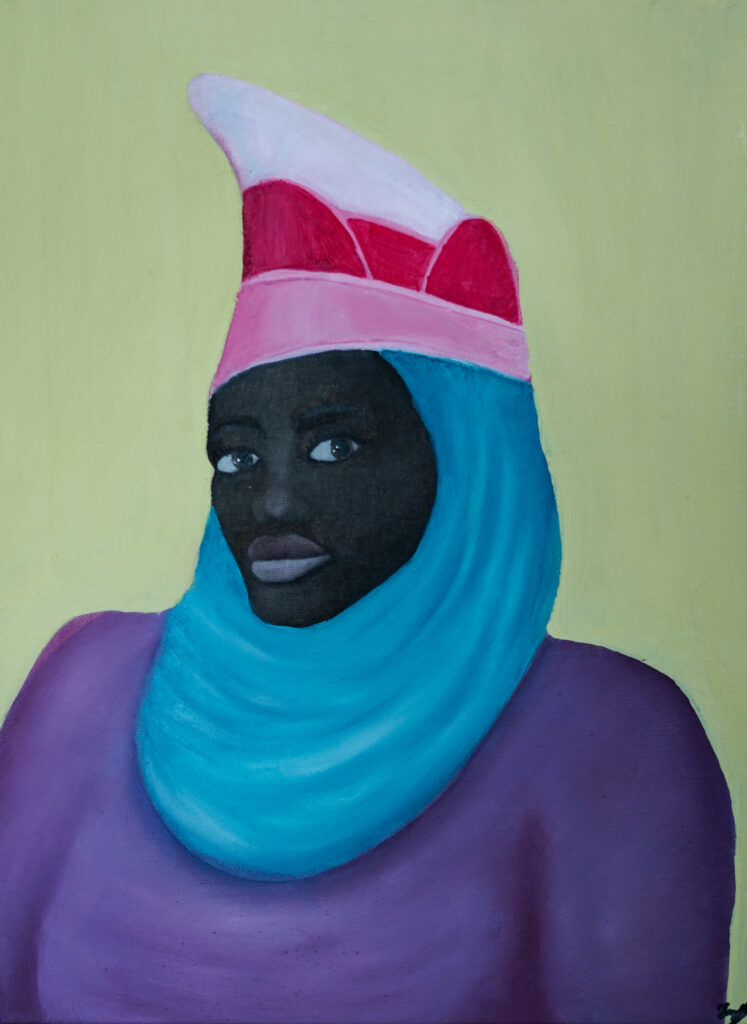
Princess Carnaval
‘Princess Carnaval’ est une œuvre représentant une femme imaginaire noire et musulmane avec un chapeau de carnaval. Les fondements du carnaval limbourgeois proviennent de la tradition catholique et du carnaval rhénan du XIXe siècle. Pendant longtemps, il n’y avait pas de place pour les non-catholiques et les femmes. De nos jours, de nombreuses associations abandonnent cette manière de penser et considèrent le carnaval comme une fête du lieu de résidence, de la Limbourg et du Sud. Cependant, nous voyons encore peu de princesses du carnaval régner seules. Devrions-nous nous accrocher à nos traditions ?
Créé en : 2023
Matériaux : Peinture à l’huile
Dimensions : 40 x 30 cm
La Lutte entre l’Utopie et la Nostalgie
Cette série de tableaux se compose toujours de contrastes. Global ou local, mondain ou villageois, chaos ou calme, conservateur ou progressiste. Dans ‘La Lutte entre l’Utopie et la Nostalgie’, je remets en question cette façon de penser. L’œuvre est basée sur ‘La Lutte entre le Carême et le Carnaval’ de Pieter Bruegel l’Ancien, peint en 1559. Tout comme le Carême et le Carnaval à l’époque, les idées sur le passé et le futur s’opposent dans notre époque. L’utopie est un rêve d’avenir, souvent accompagné d’un profond mécontentement envers le présent. La nostalgie est un sentiment, mais aussi une image soigneusement construite de ce qui était autrefois et ne reviendra jamais (ou, en d’autres termes, un profond mécontentement envers le présent). Je voudrais encourager le spectateur à regarder au-delà de la lutte. C’est en fait une lutte profondément ancrée dans nos esprits. Mais cette lutte est une illusion. Une illusion aux conséquences profondes.
Créé en : 2023
Matériaux : Feutre, Peinture à l’huile
Dimensions : 140 x 90 cm (2x 70 x 45 cm)
Conclusion
Merci d’avoir visité mon exposition en ligne. Si vous avez des questions, je suis toujours prêt à y répondre. Vous pouvez trouver mes coordonnées sur le site web.
If you enjoy my work and would like to support me, you can buy me a coffee via this link: Buy Me A Coffee. Your support is greatly appreciated!
On Saturday, September 9th, and Sunday, September 10th, 2023, I held an exhibition at the SooS titled ‘Global Village.’ In this exhibition, I displayed twelve canvas works created around the theme of village life in times of globalization. In this exhibition, I consistently juxtaposed two paintings: one depicting the perspective from within and the other offering an external perspective. You can read about my exhibition in the news on WeertDeGekste. Following this physical exhibition, I decided to make the series digitally accessible for those who couldn’t attend in person and other interested individuals. Below, you’ll find the six themes, each accompanied by two works, along with the texts that were also displayed in the physical exhibition space. I hope you enjoy exploring them.
Borders
Borders are imaginary; they are an expression of our collective imagination. A border exists on paper, through symbols, and in our language. They have a significant impact on our perception of the world. These two works are based on the aerial view of Europe and Tungelroy, respectively. Both paintings explore the relationship between abstract borders, memory, and meaning.
The Abstract Concept of Europe
‘The abstract concept of Europe’ was created immediately after my Erasmus experience in Glasgow. The style was inspired by Kandinsky. The artwork was created with memories of the Erasmus period in mind. Not only my personal life, such as relationships and friendships that were formed and experienced during that time but also the context in which the Erasmus period took place, inspired me to create an abstract visualization of my four months abroad. It was the period when the United Kingdom officially left the European Union. The work is abstract because the whole idea of Europe, the European Union, and European identity is abstract.
Created: 2020
Materials: Acrylic
Dimensions: 60 x 80 cm
Memories
‘Memories’ is inspired by my hometown, Tungelroy. In a surreal manner, this work connects memories from my youth with their geographical locations. Nights out, fanfare rehearsals, walks, bike rides—they all find their place in this painting. The village is layered in time, where history and the present intersect. This gives the painting its depth.
Created: 2022
Materials: Acrylic, Oil paint
Dimensions: 60 x 80 cm
Monuments
A village is recognizable by its mill, church tower, school, playgrounds, and parks. Buildings form the core of a residential area and reveal the structure of a village. In Tungelroy, the church tower still dominates the streetscape. The church follows the Christian feasts season after season. Birth, love, and death follow one another. There’s something natural about this cyclical life but beware. The walls have eyes, and people ask questions. It’s not mentally easy to be ‘different’ when everything is supposed to follow its supposed natural course.
Tranquility
‘Tranquility’ represents the calm and peace that the village offers. The feeling of safety. You know what to expect. You stand in the middle of nature and follow the historical path laid out by the community. Traditions are beautiful and should be preserved. The village offers an escape from the hustle and bustle of the city. Village life is a dream.
Created: 2022
Materials: Acrylic, Oil paint
Dimensions: 40 x 30 cm
Skyline T-Roy
‘Skyline T-Roy’ questions the natural cyclical thinking. The work follows the weather cycle from left to right, from good to bad. During this journey, the viewer encounters financial pressure, time pressure, the pressure of traditions, and the pressure of the village community.
Created: 2023
Materials: Acrylic, Oil paint
Dimensions: 120 x 30 cm
The circle of life
Is a closed ring
The ring is ticking
Like an index finger
The finger of the neighbour
Points at the concrete wall
The walls have ears
And the houses have eyes
The working-class hero
The passing of the year
The couch in front of the TV
Are you really here?
Humans
Creating a portrait of a person is difficult. If you create a photorealistic portrait, you miss the nuances and inner beauty. If you create an abstract portrait, no one sees the body language and appearance. Nevertheless, within this series, I opted for the abstract option. These two portraits symbolize two people from my village. On one side, a true Limburg Lady, who is rooted in the existing customs and traditions of the village. On the other hand, a true global citizen, who is open to self-examination and reinvention.
MK
‘MK’ symbolizes a genuine Limburg Maedje. Like the Tungelroyse Beek, she is inseparably connected to the place. The village is an integral part of her, and she is an integral part of the village. Without one, the other would lose its meaning.
Created: 2023
Materials: Acrylic, Oil paint
Dimensions: 120 x 90 cm
KH
‘KH’ represents an artistic open personality. Adventure, exploration, and openness are keywords in her life. She ventures out from time to time to enrich the village with her new knowledge and ideas.
Created: 2022
Materials: Acrylic, Oil paint
Dimensions: 120 x 90 cm
Language
Language says something about who you are and how you want to present yourself. Thus, language is an important carrier of identity. Limburgers see the Limburgish language and expressions as something unique, and in a way, it is. Every locality has its own variations in dialect. Dich, diech, du: you can hear it all here. The use of language and the social meanings of language exist worldwide. Everyone uses language to set themselves apart from others and join a specific group. These languages together form the languages of the world. Together, we are the world.
Limburgs
‘Limburgs’ is a layered mixed-media work. In a self-made alphabet inspired by melodic musical notes, you can read a decade’s worth of quotes from my good Limburgish friends. Maps of linguistic research on Limburgish dominate the work. Two centuries ago, Limburgish was not seen as a language. During that time, scientists and historians actively worked to give the province its language and identity. This eventually gave rise to our complex Limburgish identity. And the fish? That’s the Limburgish language, swimming between Dutch, German, and French.
Created: 2023
Materials: Print, Oil paint
Dimensions: 50 x 50 cm
Languages
‘Languages’ is a mixed-media work created using AI, Photoshop, oil paint, and, most importantly, quotes from friends and acquaintances from all over the world. For this work, I asked more than fifty people to send in their favourite sayings and quotes. Afrikaans, Arabic, Russian, Norwegian, Hindi—it’s all there. Together, we form the water in which all languages can swim. Together, we are the languages of the world.
Created: 2023
Materials: Print, Marker, Oil paint
Dimensions: 50 x 50 cm
Carnaval
Limburgers look forward to it all year: carnival. Fortunately, we have to wait less and less before we can celebrate the carnival. Nowadays, the entire year is filled with afterparties and summer carnivals. The Carnival tradition has historical roots, although modern celebrations are relatively new. It wasn’t until after World War II that Carnival evolved into what we know today. Nevertheless, we hold firmly to the traditions and customs that our grandparents devised. Why?
Prince Carnaval
‘Prince Carnaval’ is an abstract work that showcases the multiple facets of carnival. Everything is chaotic and wild, fun and musical. Everyone participates, and everyone can be who they want to be. During the carnival, the world turns upside down for a while. Isn’t that delightful!
Created: 2023
Materials: Oil paint
Dimensions: 40 x 30 cm
Princess Carnaval
‘Princess Carnaval’ is a work depicting an imaginary black Islamic woman wearing a carnival hat. The foundations of the Limburgish carnival stem from the Catholic tradition and the 19th-century Rhineland Carnival. Consequently, there was no place for non-Catholics and women for a long time. Nowadays, many associations are letting go of this mindset, and they view carnival as a celebration of the locality, of Limburg, and of the South. Nevertheless, we still see very few carnival princesses who reign alone. Should we hold on to our traditions?
Created: 2023
Materials: Oil paint
Dimensions: 40 x 30 cm
De Fight between Utopia and Nostalgia
This series of paintings consists of opposites: global or local, worldly or rural, chaos or tranquillity, conservative or progressive. In ‘The Struggle between Utopia and Nostalgia,’ I question this way of thinking. The work is based on ‘The Fight between Carnival and Lent’ by Pieter Bruegel the Elder, painted in 1559. Just like Carnival and Lent at that time, ideas about the past and future clash in our time. Utopia is a dream of the future, often accompanied by a deep-seated discontent with the present. Nostalgia is a feeling but also a carefully constructed image of what once was and will never return (or, in other words, a deep-seated discontent with the present). I would like to challenge the viewer to look beyond the struggle. It is, in fact, a struggle deeply rooted in our minds. But that struggle is an illusion. An illusion with profound consequences.
Created: 2023
Materials: Marker, Oil paint
Dimensions: 140 x 90 cm (2x 70 x 45 cm)
Conclusion
Thank you for visiting my online exhibition. If you have any questions, I am always available to answer them. You can find my contact information on the website.
Als je mijn werk leuk vindt en me wilt steunen, kun je me een koffie kopen via deze link: Buy Me A Coffee. Je steun wordt zeer gewaardeerd!
Op zaterdag 9 en zondag 10 september 2023 hield ik een expositie in de SooS met de titel ‘Global Village’. In deze expositie toonde ik twaalf werken op doek gemaakt rond het thema dorpsleven in tijden van globalisering. In deze expositie zette ik steeds twee schilderijen tegenover elkaar. Het ene werk gaf het perspectief van binnenuit en het andere werk het perspectief van buitenaf. Zie het nieuwsbericht over mijn tentoonstelling op WeertDeGekste. Na deze fysieke expositie besloot ik om de serie digitaal ook inzichtelijk te maken voor mensen die niet aanwezig konden zijn en andere geïnteresseerden. Hieronder vinden jullie de zes thema’s met telkens twee werken. Deze zijn vergezeld door de teksten die ook fysiek in de expositieruimte hingen. Ik wens jullie veel kijkplezier.
Grenzen
Grenzen zijn denkbeeldig: ze zijn een uitdrukking van onze collectieve verbeelding. Een grens bestaat op papier, uit symbolen en in onze taal. Ze hebben grote invloed op onze ervaring van de wereld. Deze twee werken zijn gebaseerd op het bovenaanzicht van enerzijds Europa en anderzijds Tungelroy. Beide schilderijen onderzoeken de relatie tussen abstracte grenzen, herinnering en betekenisgeving.
The Abstract Concept of Europe
‘The abstract concept of Europe’ is gemaakt direct na mijn Erasmus in Glasgow. De stijl is geïnspireerd door Kandinsky. Het kunstwerk is gemaakt met de herinnering aan de Erasmusperiode. Niet alleen mijn persoonlijke leven, zoals (liefdes)relaties en vriendschappen die daar zijn ontstaan en beleefd, maar ook de context waarin de Erasmusperiode zich afspeelde inspireerde mij tot het maken van een abstracte visualisatie van mijn vier maanden in het buitenland. Het was de periode waarin het Verenigd Koninkrijk officieel de Europese Unie zou verlaten. Het werk is abstract, want het hele idee van Europa, de Europese Unie en van een Europese identiteit is abstract.
Gemaakt: 2020
Materialen: Acryl
Afmetingen: 60 x 80 cm
Memories
‘Memories’ is geïnspireerd op mijn geboortedorp, Tungelroy. Op een surrealistische wijze maak ik in dit werk een verbinding tussen herinneringen uit mijn jeugd en hun geografische locatie. Stapavonden, fanfarerepetities, wandelingen, fietstochten: het krijgt allemaal een plaats. Het dorp is immers gelaagd in tijd, waarin de historie en het heden elkaar kruisen. Dit geeft het schilderij zijn gelaagdheid.
Gemaakt: 2022
Materialen: Acryl, Olieverf
Afmetingen: 60 x 80 cm
Monumenten
Een dorp is herkenbaar aan de molen, de kerktoren, de school, speeltuinen en parken. Gebouwen vormen de kern van een woonplaats en leggen de structuur van een dorp bloot. In Tungelroy domineert de kerktoren nog altijd het straatbeeld. De kerk volgt seizoen op seizoen de christelijke feesten. Geboorte, liefde en overlijden volgen elkaar op. Het heeft iets natuurlijks, dit cyclische leven, maar pas op. De muren hebben ogen en mensen stellen vragen. Het is mentaal niet makkelijk ‘anders’ te zijn als alles zijn vermeende natuurlijke gang moet gaan.
Tranquility
‘Tranquility’ staat voor de kalmte en rust die het dorp biedt. Het gevoel van veiligheid. Je weet waar je aan toe bent. Je staat midden in de natuur en volgt de historische weg die de gemeenschap voor je heeft uitgestippeld. Tradities zijn mooi en zouden in ere gehouden moeten worden. Het dorp biedt een ontsnapping aan de hectiek van de stad. Dorpsleven is een droom.
Gemaakt: 2022
Materialen: Acryl, Olieverf
Afmetingen: 40 x 30 cm
Skyline T-Roy
‘Skyline T-Roy’ plaatst vraagtekens bij het natuurlijke cyclische denken. Het werk volgt van links naar rechts de weercyclus, van goed naar slecht. Tijdens deze reis ontmoet de kijker financiële druk, tijdsdruk, de druk van tradities en druk van de dorpsgemeenschap.
Gemaakt: 2023
Materialen: Acryl, Olieverf
Afmetingen: 120 x 30 cm
The circle of life
Is a closed ring
The ring is ticking
Like an index finger
The finger of the neighbour
Points at the concrete wall
The walls have ears
And the houses have eyes
The working-class hero
The passing of the year
The couch in front of the TV
Are you really here?
Mensen
Een portret van een persoon maken is moeilijk. Maak je een fotorealistisch portret, dan mis je de nuances en schoonheid van het innerlijk. Maak je een abstract portret, dan ziet niemand de lichaamstaal en het uiterlijk. Toch heb ik binnen deze reeks voor de abstracte optie gekozen. Deze twee portretten symboliseren twee mensen uit mijn dorp. Aan de ene kant een écht Limburgs Maedje, geworteld in de bestaande gebruiken en tradities van het dorp. Aan de andere kant een echte wereldburger, open om zichzelf te bevragen en telkens weer te heruitvinden.
MK
‘MK’ is de symbolisering van een echt Limburgs Maedje. Net als de Tungelroyse Beek is ze onafscheidelijk verbonden met de plaats. Het dorp is integraal onderdeel van haar en zij is integraal onderdeel van het dorp. Zonder het een zou het ander zijn betekenis verliezen.
Gemaakt: 2023
Materialen: Acryl, Olieverf
Afmetingen: 120 x 90 cm
KH
‘KH’ gaat over een artistieke open persoonlijkheid. Avontuur, ontdekken en openheid zijn kernwoorden binnen haar leven. Ze vliegt uit om van tijd tot tijd met haar nieuwe kennis en ideeën het dorp te verrijken.
Gemaakt: 2022
Materialen: Acryl, Olieverf
Afmetingen: 120 x 90 cm
Taal
Taal zegt iets over wie je bent en over hoe je jezelf neer wilt zetten. Zo is taal een belangrijke identiteitsdrager. Limburgers zien de Limburgse taal en uitdrukkingen graag als iets unieks. Dat is het in zekere zin ook. Iedere woonplaats kent zijn eigen variaties in het dialect. Dich, diech, du: hier hoor je het allemaal. Het gebruik van taal en de sociale betekenissen van taal bestaan over de hele wereld. Iedereen gebruikt taal om zichzelf af te zetten tegen de rest en zich bij een bepaalde groep te scharen. Deze talen samen vormen de talen van de wereld. Samen zijn we de wereld.
Limburgs
‘Limburgs’ is een gelaagd Mixed Media werk. In een zelfgemaakt alfabet, geïnspireerd door zangerige muzieknoten, is een decennium aan quotes terug te lezen van mijn goede Limburgse vrienden. Kaarten van linguïstisch onderzoek naar het Limburgs domineren het werk. Twee eeuwen geleden zag men Limburgs nog niet als een taal. Wetenschappers en historici zetten zich in deze tijd actief in om de provincie zijn taal en identiteit te geven. Zo ontstond uiteindelijk onze gecompliceerde Limburgse identiteit. En de vis? Dat is de Limburgse taal, zwemmend tussen het Nederlands, Duits en Frans.
Gemaakt: 2023
Materialen: Print, Olieverf
Afmetingen: 50 x 50 cm
Languages
‘Languages’ is een Mixed Media werk gemaakt met behulp van AI, Photoshop, olieverf en vooral quotes van vrienden en kennissen van over de hele wereld. Voor dit werk vroeg ik aan meer dan vijftig mensen om hun favoriete gezegden en quotes door te sturen. Afrikaans, Arabisch, Russisch, Noors, Hindi: het zit er allemaal in. Zo vormen wij samen het water waarin alle talen kunnen zwemmen. Wij vormen samen de talen van de wereld.
Gemaakt: 2023
Materialen: Print, Stift, Olieverf
Afmetingen: 50 x 50 cm
Carnaval
Limburgers kijken er het hele jaar naar uit: carnaval. Gelukkigen hoeven we steeds minder lang te wachten voordat we carnaval kunnen vieren. Inmiddels staat het hele jaar vol met afterparty’s en zomercarnavals. De vasteloavendtraditie is er een met historische wortels, al is de moderne viering vrij nieuw. Pas na de Tweede Wereldoorlog ontpopte het carnaval zich zoals wij het kennen. Toch houden we stevig vast aan de tradities en gebruiken die onze grootouders bedachten. Waarom?
Prince Carnaval
‘Prince Carnaval’ is een abstract werk dat de meerdere gezichten van het carnaval laat zien. Alles is chaotisch en gek, gezellig en muzikaal. Iedereen doet mee en iedereen kan zijn wie ze willen zijn. De wereld draait tijdens het carnaval even op zijn kop. Dat is toch heerlijk!
Gemaakt: 2023
Materialen: Olieverf
Afmetingen: 40 x 30 cm
Princess Carnaval
‘Princess Carnaval’ is een werk van een imaginaire zwarte islamtische vrouw met een carnavalssteek. De fundamenten van het Limburgse carnaval komen voort uit de katholieke traditie en het 19e-eeuwse Rijnlandse carnaval. Zodoende was er lange tijd geen plek voor niet-katholieken en vrouwen. Tegenwoordig laten veel verenigingen deze denkwijze los en ze we het carnaval als een feest van de woonplaats, van Limburg en van het Zuiden. Toch zien we nog maar weinig carnavalsprinsessen die alleen regeren. Moeten we vasthouden aan onze tradities?
Gemaakt: 2023
Materialen: Olieverf
Afmetingen: 40 x 30 cm
De Strijd tussen de Utopie en de Nostalgie
Deze reeks schilderijen bestaat telkens uit tegenstellingen. Globaal of lokaal, werelds of dorps, chaos of rust, conservatief of progressief. In ‘De Strijd tussen de Utopie en de Nostalgie’ bevraag ik deze manier van denken. Het werk is gebaseerd op ‘De Strijd tussen Vasten en Vastenavond’ van Pieter Bruegel de Oude, geschilderd in 1559. Net als het Vasten en de Vastenavond in die tijd staan in onze tijd ideeën over verleden en toekomst elkaar in de weg. Een utopie is een toekomstdroom, vaak samengaand met een diepgewortelde ontevredenheid over het heden. Nostalgie is een gevoel, maar ook een zorgvuldig geconstrueerd beeld van wat ooit was en wat nooit meer terug zal komen (ofwel een diepgewortelde ontevredenheid over het heden). Ik zou de kijker willen uitdagen om voorbij de strijd te kijken. Het is namelijk een strijd die diepgeworteld in onze hoofden zit. Maar die strijd is een illusie. Een illusie met ingrijpende gevolgen.
Gemaakt: 2023
Materialen: Stift, Olieverf
Afmetingen: 140 x 90 cm (2x 70 x 45 cm)
Conclusie
Bedankt voor het bezoeken van mijn online tentoonstelling. Als er vragen zijn sta ik altijd klaar om deze te beantwoorden. Jullie kunnen mijn contactgegevens vinden op de website.
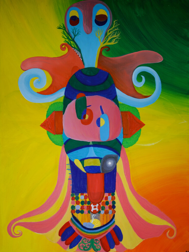
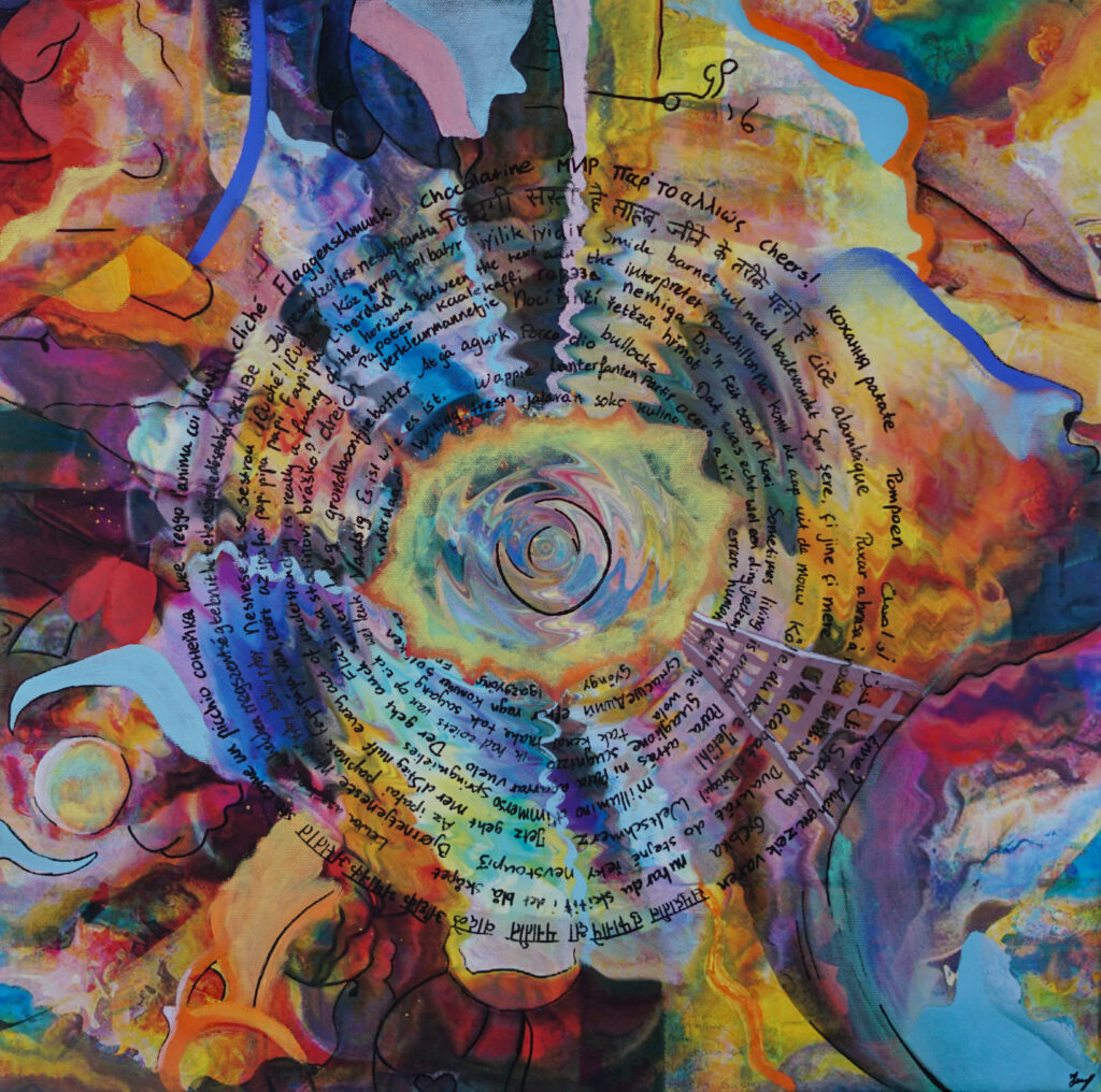
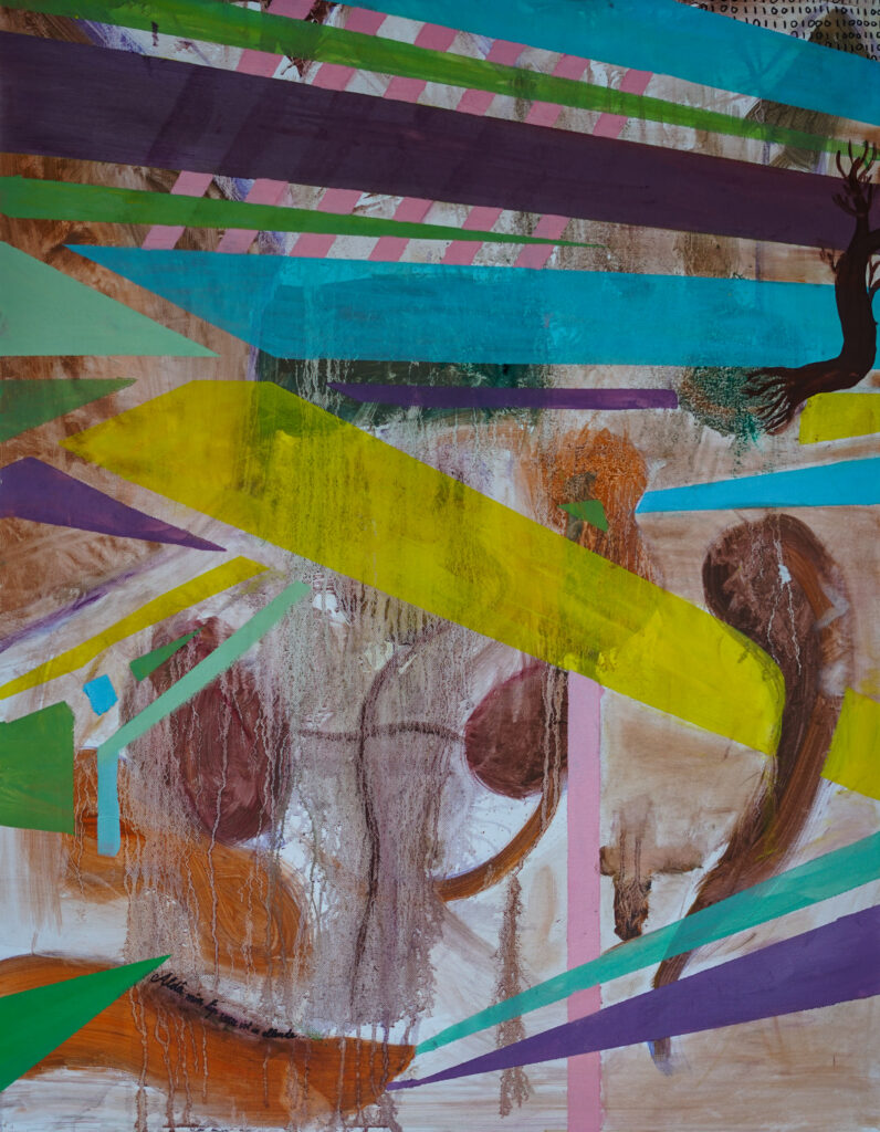
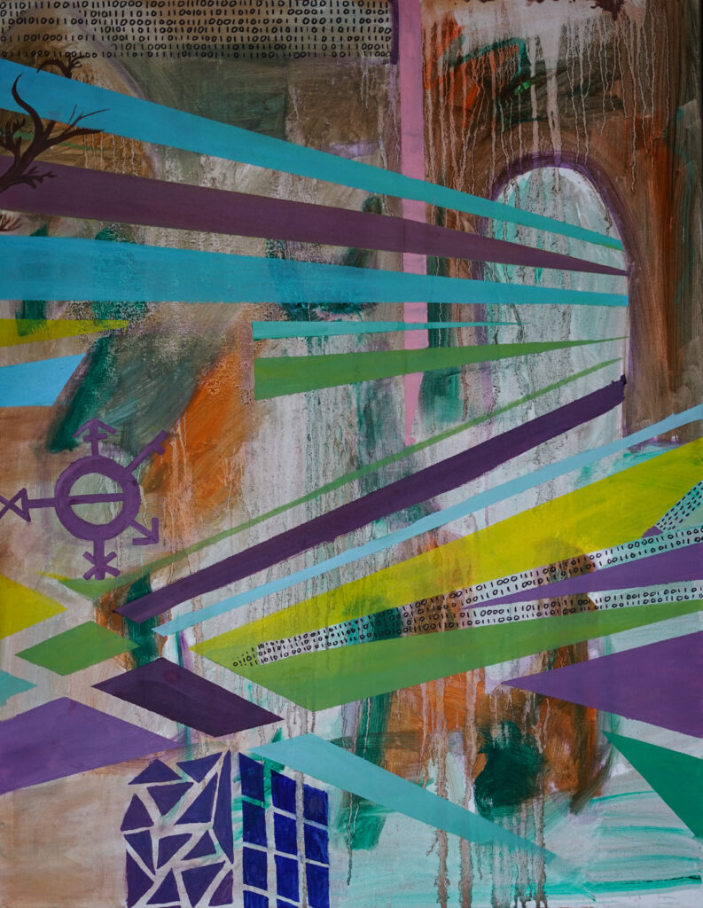
Dans cet article de blog, j’expliquerai mes deux travaux récents, « Limburgish » et « Languages ». Ces œuvres ont été créées grâce à des recherches historiques, l’utilisation de la technologie moderne et des dizaines de citations d’amis proches et éloignés. À l’aide de ces outils, j’enquête sur la relation entre la langue et l’identité. Je tiens à remercier chacun pour sa contribution à ce travail.
« Limburgish » est une pièce qui explore la construction de la langue limburgoise. Avant l’existence de la province de Limbourg ou de la nation néerlandaise, personne n’appelait Limbourg Limbourg. Par conséquent, personne ne reconnaissait la langue limburgoise. Cependant, après la construction de la nation néerlandaise, les gens ont commencé à construire une identité limburgoise et, avec elle, une langue limburgoise. Dans la pièce multimédia, j’ai utilisé de vieilles cartes trouvées dans la recherche linguistique pour cartographier la langue limburgoise. Il était fascinant de voir comment la langue était construite et devenait de plus en plus similaire aux limites des provinces du Limbourg au fil du temps. J’ai également incorporé des recherches sur la tonalité et la prononciation de la langue, ainsi que des dictionnaires locaux limburgois.
En plus de ces éléments historiques, j’ai créé ma propre police pour la pièce. La police utilise des lettres inspirées de notes de musique disposées sur une partition vierge. À l’aide de ces lettres, j’ai écrit des citations que mes amis limburgois proches ont dites au cours de la dernière décennie. Les citations ont ajouté une touche personnelle à la pièce, et la police inspirée des notes de musique représentait la musicalité de la langue.
L’une des caractéristiques les plus remarquables de « Limburgish » est la forme de poisson dans les contours des deux Limbourg. Le poisson représente la nature intermédiaire du Limbourg, une région qui se situe à la frontière entre la Belgique, l’Allemagne et les Pays-Bas. Tout comme le poisson nage entre l’eau, la langue limburgoise peut être considérée comme un mélange de néerlandais et d’allemand, avec des influences du français (et récemment de l’anglais) également. Le symbole du poisson continuera d’apparaître dans mes travaux futurs en tant que symbole de l’identité limburgoise.
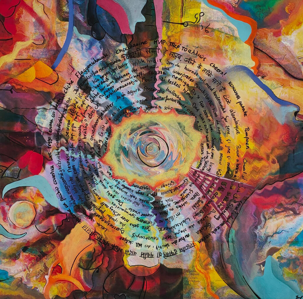
« Languages » est une autre pièce multimédia qui explore la fluidité de la langue et sa nature démocratique. L’œuvre est un mélange d’art numérique, de peinture à l’huile et de marqueurs. Pour le fond de la pièce, j’ai créé plusieurs poèmes basés sur une carte mentale. Ensuite, j’ai utilisé l’IA pour transformer ces poèmes en invites et j’ai utilisé AI Image Creators pour créer une vingtaine d’images. Ceux-ci ont finalement jeté les bases de ce travail.
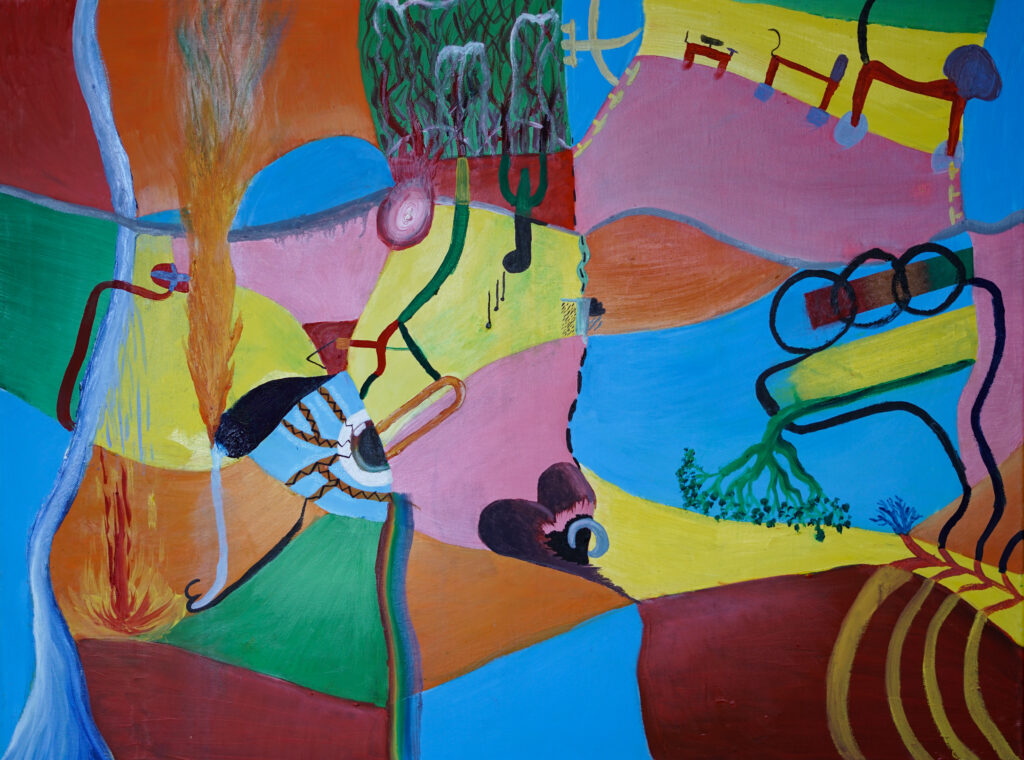
Les éléments centraux de « Languages » sont l’utilisation de l’eau et du feu. Dans les ondulations de l’eau, on peut lire différentes citations que j’ai recueillies de mes amis internationaux. Ces citations représentent la nature diversifiée et dynamique de la langue – la beauté de la langue. Le feu au milieu représente la puissante force derrière les langues. La langue a la capacité de créer, de détruire et de transformer. Tout comme le Big Bang, la langue est soudaine mais se déploie avec le temps.
Voici quelques exemples de citations que des gens m’ont envoyées :
мир = paix
сонейка = soleil, vous pouvez également appeler une personne qui vous aimezappréciez de cette façon
Megszentségteleníthetetlenségeskedésetekért
u har du skitit i det blå skåpet = maintenant vous avez merdé dans l’armoire bleue
Kaalekaffi = café froid
Patate = pomme de terre (Wallonian French)
قل خيرا أو أصمت. = dis du bien ou tais-toi
जिंदगी सस्ती है साहब, जीने के तरीके महंगे हैं। = la vie est bon marché, c’est la façon dont nous vivons qui est chère
Limburgish et Languages s’entrelacent parce que, avec l’utilisation de ce symbolisme, Limburgish est comme un poisson dans l’eau (un idiome en néerlandais également). Limburgish fait partie d’un tout plus grand, la totalité en constante évolution des langues.
Ces œuvres font partie d’une série plus grande appelée « Village Life ». Cette série examinera les effets de la mondialisation sur le village et sera composée de six fois deux œuvres. Chaque ensemble de peintures se contredira mutuellement dans leur signification et créera de la friction. Je prévois de tenir une exposition avec ces œuvres à l’été 2023.
In dit blogbericht zal ik mijn twee recente werken, ‘Limburgish’ en ‘Languages’ toelichten. Deze werken zijn tot stand gekomen aan de hand van historisch onderzoek, het gebruik van moderne technologie en tientallen quotes van verre en dichte vrienden. Aan de hand van deze tools onderzoek ik de relatie tussen taal en identiteit. Ik wil iedereen bedanken voor hun bijdrage aan dit werk.
‘Limburgish’ is een werk dat zich verdiept in de constructie van de Limburgse taal. Voordat de provincie Limburg of de Nederlandse natie bestond, noemde nog niemand Limburg Limburg. Niemand erkende de taal in deze provincies als Limburgs. Na de constructie van de Nederlandse natie begonnen mensen echter een Limburgse identiteit te construeren en daarmee een Limburgse taal. In dit mixed media-stuk gebruikte ik oude kaarten, gevonden in linguïstisch onderzoek naar de Limburgse taal. Het was fascinerend om te zien hoe de taal zich ontwikkelde. De taalkaarten, die aan het begin nog vrij onsamenhangend waren, leken na verloop van tijd steeds meer op de provincies Limburg. Ik heb ook onderzoek naar de tonaliteit en uitspraak van het Limburgs, evenals lokale Limburgse woordenboeken, verwerkt in het werk.
Naast deze historische elementen heb ik mijn eigen lettertype voor het werk gemaakt. Het lettertype is geïnspireerd op muzieknoten. Met behulp van deze letters schreef ik enkele citaten van mijn groep Limburgse vrienden. De citaten voegen een persoonlijk tintje toe aan het werk, en het muzieknoot-geïnspireerde lettertype vertegenwoordigt de ‘zangerigheid’ van het Limburgs.
Een van de meest opvallende kenmerken van ‘Limburgish’ is de visvorm in de omtrekken van de twee Limburgen. De vis staat voor de tussennatuur van Limburg, een regio die op de grens ligt tussen België, Duitsland en Nederland. Net zoals de vis in het water zwemt, zit de Limburgse taal tussen Nederlands en Duits, met invloeden van Frans. Het vis-symbool zal blijven terugkeren in mijn toekomstige werken als symbool van de Limburgse identiteit.
‘Languages’ is een ander mixed media-stuk dat de dynamiek van taal en de democratische aard ervan verkent. Het werk is een mix van digitale kunst, olieverf en stiften. Voor de achtergrond van het stuk creëerde ik verschillende gedichten op basis van een mindmap. Vervolgens gebruikte ik AI om deze gedichten om te zetten in prompts en gebruikte ik AI Image Creators om ongeveer twintig afbeeldingen te maken. Deze legden uiteindelijk het fundament voor dit werk.
De centrale elementen van ‘Languages’ zijn het gebruik van water en vuur. In de water rimpelingen kan men verschillende quotes lezen die ik verzameld heb van mijn internationale vrienden. Deze citaten vertegenwoordigen de diverse en dynamische aard van taal – de schoonheid van taal. Het vuur in het midden vertegenwoordigt de kracht achter talen. Taal heeft het vermogen om te creëren, te vernietigen en te transformeren. Net zoals de oerknal is taal plotseling maar ontvouwt zich gedurende de tijd.
Enkele voorbeelden van quotes die vrienden stuurden:
мир = vrede
сонейка = zon, maar zo kan je ook een persoon noemen waarvan je houdt
Megszentségteleníthetetlenségeskedésetekért
u har du skitit i det blå skåpet = nu heb je gepoept in de blauwe kast
Kaalekaffi = koude koffie
Patate = aardappel (Waals)
قل خيرا أو أصمت. = spreek goed of blijf stil
जिंदगी सस्ती है साहब, जीने के तरीके महंगे हैं। = het leven is goedkoop, het is de manier waarop we leven die duur is
De twee werken zijn met elkaar verweven, omdat binnen de gebruikte symboliek, het Limburgs als een vis in het water is. Het Limburgs als categorie zit tussen talen in, maar maakt als gegeven onderdeel uit van het grotere geheel – de altijdveranderende totaliteit aan talen.
Deze werken maken deel uit van een grotere serie genaamd ‘Village Life’. In deze serie onderzoek ik de effecten van globalisering op het dorp. De serie zal bestaan uit zes keer twee werken. Elke set schilderijen zal elkaar tegenspreken en wrijving creëren. Ik ben van plan om in de zomer van 2023 een tentoonstelling te houden met deze werken.
In this blog post, I will explain the background of my two recent works, ‘Limburgish’ and ‘Languages’. These works have been created through historical research, the use of modern technology and dozens of quotes from distant and close friends. Using these tools, I investigate the relationship between language and identity. I would like to thank everyone for their contribution to this work.
‘Limburgish’ is a piece that delves into the construction of the Limburgish language. Before the Limburgish province or the Dutch nation existed, no one called Limburg Limburg. Therefore, no one acknowledged the Limburgish language. However, after the construction of the Dutch nation, people began to construct a Limburgish identity, and with it, a Limburgish language. In the mixed media piece, I used old maps found in linguistic research to map out the Limburgish language. It was fascinating to see how the language was constructed and began to resemble more and more the boundaries of the provinces of Limburg over time. I also incorporated research on the tonality and pronunciation of the language, as well as local Limburgish dictionaries.
In addition to these historical elements, I created my own font for the piece. The font uses music-note-inspired letters arranged on empty sheet music. Using these letters, I wrote quotes that my close group of Limburgish friends have said over the past decade. The quotes added a personal touch to the piece, and the music-note-inspired font represented the musicality of the language.
One of the most prominent features of ‘Limburgish’ is the fish shape in the outlines of the two Limburgs. The fish represents the in-between nature of Limburg, a region that lies on the border between Belgium, Germany, and the Netherlands. Just as the fish swims between the water, the Limburgish language can be seen as a mix between Dutch and German, with influences from French (and recently English) as well. The fish symbol will continue to appear in my future works as a symbol of Limburgish identity.
‘Languages’ is another mixed media piece that explores the fluidity of language and its democratic nature. The piece is a mix of printed media, oil paint and marker. I created several poems based on a mind map. I then used AI to turn these poems into prompts and used AI Image Creators to create around twenty images. These laid the fundaments for the rest of the work.
The central elements of ‘Languages’ is the use of water and fire. In the water ripples, one can read various quotes that I collected from my international friends. These quotes represent the diverse and dynamic nature of language – the beauty of language. The fire in the middle represents the powerful force behind languages. Language has the ability to create, destroy, and transform. Just like the Big Bang, language is sudden but unfolds over time.
Some examples of the quotes people sent me:
мир = peace
сонейка = sun, you can also call a person you love/care about this way
Megszentségteleníthetetlenségeskedésetekért
u har du skitit i det blå skåpet = now you have taken a shit in the blue cupboard
Kaalekaffi = cold coffee
Patate = Potato (Wallonian French)
قل خيرا أو أصمت. = speak good or remain silent
जिंदगी सस्ती है साहब, जीने के तरीके महंगे हैं। = life is cheap, it’s the way we live that’s expensive
‘Limburgish’ and ‘Languages’ entwine because, with the use of this symbolism, Limburgish is like a fish in water (an idiom in Dutch similar to the English idiom ‘like a duck to water’). Limburgish is part of a bigger whole, the everchanging totality of languages.
These works are part of a bigger series called ‘Village Life’. This series will examine the effects on the village by globalisation and will consist of six times two works. Each set of paintings will contradict each other’s meanings and create friction. I am planning to hold an exhibition with these works in the summer of 2023.